
With research from We Are Social showing that posts on LinkedIn that contain images have a 98 per cent better comment rate, it makes sense for businesses to not only spend time on great images for posts, but also really thinking about what image they will use for their background cover.
The old saying “a picture tells a thousand words” is very true, yet many companies miss the opportunity to really convey a compelling ‘thousand words’ type message with their cover images.
From companies who leave the default image in place (a total no-no) to those who make their cover too busy, striking a strategic balance so the cover image adds to the overall brand story and conveys the company’s offering is the end goal.
It’s often best to think of the background cover image on LinkedIn like a giant billboard – one that needs to grab attention and evoke curiosity.
Here are four different directions companies can take it from an underwhelming default and give it a wow factor.
Default Image (don’t do this):

1. The journey
Giving prospective customers a visual summary of an entire service, in this case food tours, is like taking the potential LinkedIn lead on a visual journey of what they can expect from the product or service. This is a clever use of the Background Cover Image.
In this example, from the food source to the plate or the other way around:

Straight to the Source is a company that is owned and run by chef Tawnya Bahr that offers tours to take chef’s or commercial food buyers directly to the source of where produce is made and to the plate.
Here are a couple more variations:

Chef’s harvesting their own salt for their commercial kitchens (image includes the owner of the company) and:

Here capturing fresh lobster in the ocean, while a banquet table is being prepared so they can eat directly on the beach. Doesn’t get any fresher!
2. Brand positioning
Taking the brand’s colours, font, logo and key message and giving a clear powerful image with minimal text to position the company and what they do. ‘The Law Practice’ as stated within in the image, is a leading Criminal Defence Law firm, where their tagline of ‘We’ll get you off the hook’ for first time offenders is very appealing, and cheeky enough to get cut through:

3. Company culture
Many people in senior positions can and do alter their background cover images on LinkedIn to make a stand on trending and important issues. For example, Pride Month in June. This is a powerful way to make a personal point on a cultural issue in society and show where they personally stand on it:

Many LinkedIn Company Pages also join in (see below), by changing their company logo for the month, but altering your own personal profile with the background cover image makes the statement very personal:

4. Call to action
The last suggestion as a background cover image is a direct call to action. Again, a powerful image that portrays the way you want people to feel once they purchase the product or service or how they may feel right now. The important text that relates to the image conveys what they need to know, and how they can take action:

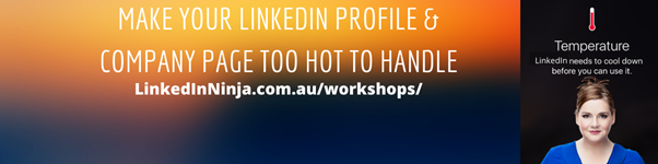
A variation on this is a direct call to action for an event. Topic, date, time and/ or the url where they can take action. Remember it is not hyperlinked so URL condensers might be needed if the URL is very long:
As with everything, there is no ‘one size fits all’ for cover images. Companies can use a variety of ways to get a message across in a LinkedIn background cover image – so get those creative juices flowing for you, and create a background image that really POPS.